One Slight Correction
Decent article by Sean Wilentz, he of Chants Democratic, in Rolling Stone (does anyone still read that?).
OK, so Bush is the worst president ever, in all likelihood. What are you going to do about it, college boy?
Wilentz errs in his assessment of Bush's relation to other presidents. He predicts--quite rightly--that Bush will have to reshuffle his staff and manufacture another national crisis to divert attention from his miserable ass, but then he relates the situation to Clinton and claims that Bill did the same things when confronted with "plummeting poll numbers."
Now, I know Wilentz isn't an idiot, and I also know his project is not to apotheosize Bill Clinton, and I further recognize that he gave the Clinton comparison in an offhand, "everybody knows how Ol' Bill played to public opinion" way. But you would think, wouldn't you, that an historian could be bothered to look up the facts before repeating a piece of vile, right-wing slander? "Plummeting poll numbers" doesn't describe any part of Clinton's presidency. He was a popular president, and especially at the end incredibly popular, across the entire span of time he held the office.
I looked it up on the Roper Center's website. It has poll results for most presidents since the 1940's, including Clinton and Bush. And guess what? Clinton's poll numbers can never be described by any reasonable standard as having "plummeted." The numbers are remarkably consistent from week to week, poll to poll. Compared to Bush, Clinton only scored in the 30's on approval about a dozen times over 8 years (or 416 weekly polls...but who's counting?), suggesting to me that those numbers are statistical outliers.
In fact, why don't you just look at a graph?

Unfortunately, because I'm not tech savvy, I couldn't get a graph that covers his entire presidency. But the Roper Center has one, right here.
Now compare that relatively straight (or at least constant) line to Bush's ratings thus far:
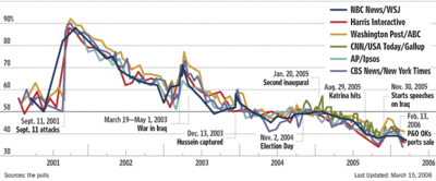
Not even close, is it? To see the Roper Center graph, go here.
So, good work calling out the Chimperor, Sean, but watch the easy/lazy comparisons, will you?

<< Home